Logo Design
from local projects
Since 2021, I’ve worked as an independent graphic designer, getting to work with new local businesses, community non-profits, and independent authors. I’ve highlighted here my process for logo design and illustration within various projects.
LLL Ranch One
LLL Ranch One started as an Ohio family’s passion project that has now grown into a lifestyle. Because this family wanted to turn their hobby into a tradition, I strove to make a seal that captured the ruggedness and the nuance of their growing farm.
Ideation
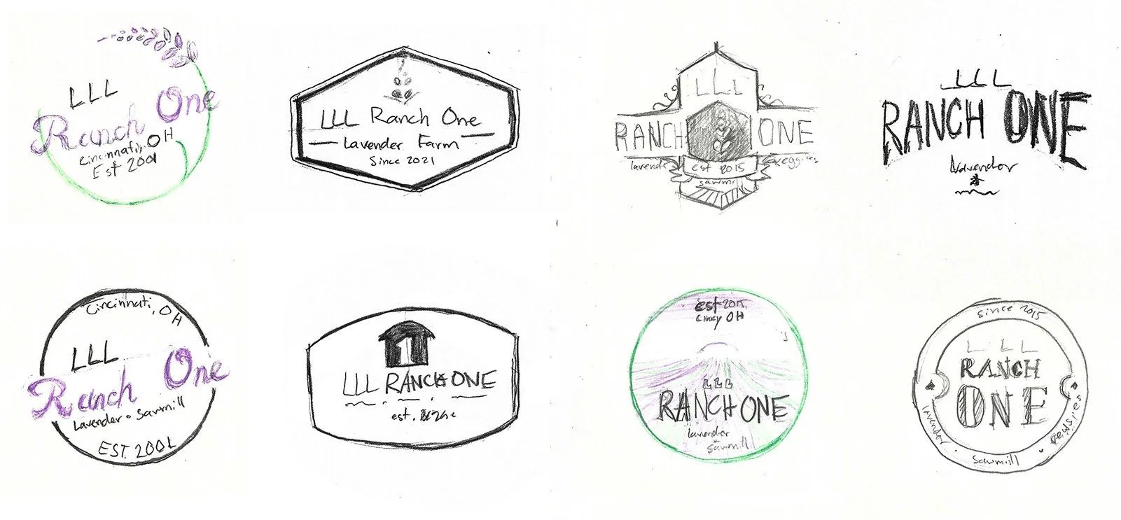
I begin with pencil sketches, striving for conceptual variation. Although the farm was newer, we opted for a badge-like design to communicate heritage, and would communicate the newness through the typographic and shape details.
Iteration
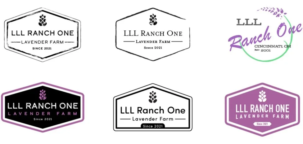
Settling on two logo types, I iterated upon the details, striving to create a different look and feel while keeping the same shape and structure.
Finalize
After the shape and style had been decided, I was presented the final challenge of making this design feel like a badge. I used my knowledge of color and figure-ground create an identity that was contained within its own shape and not lines upon a canvas.

Amora: A tale of two Brothers
Noah Douglas, a young author from Felicity, Ohio, commissioned cover artwork for this first novel in his fantasy series. The cover design simulated an old leather tome, but the greatest challenge was bringing to life a recurring bird symbol from the story.
Ideation
The symbol is described in the story as a bird of prey with a sword impaling it from above, so I experimented with different visual styles and poses, settling on a form and style that was powerful, and simple enough to showcase it’s form when placed on a highly-textured leather and metal cover.
Cover Layout and Stylization
I anchored the symbol by ideating upon cover layouts, using lines and my custom runic language to complement and anchor the symbol.
After the full layout was designed, I brought the design into Adobe Photoshop to add the effects and textures to make the cover resemble a leather tome.
Final Print


Trent’s Diesel Repair
This logo was done as a commission for a growing business in Lima, IN. This design presented the challenge and opportunity of creating something that was simple, modern, professional, while still capturing a masculine energy.
Ideation
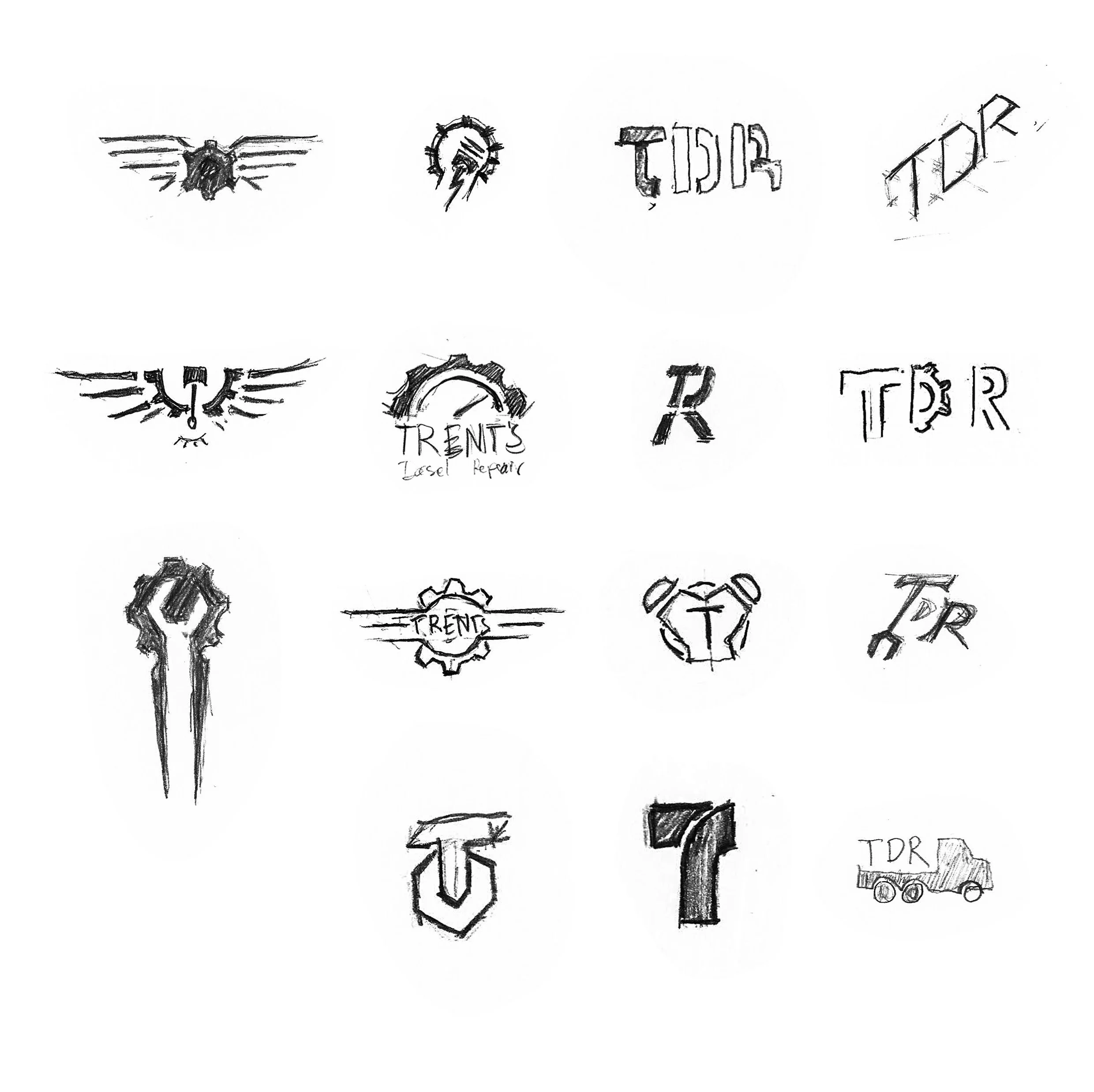
I begin with pencil sketches, striving for conceptual variation. Since the client was unsure about the final look, I sketched a mix of graphic logos, abstract icons, lettermarks.
Iteration
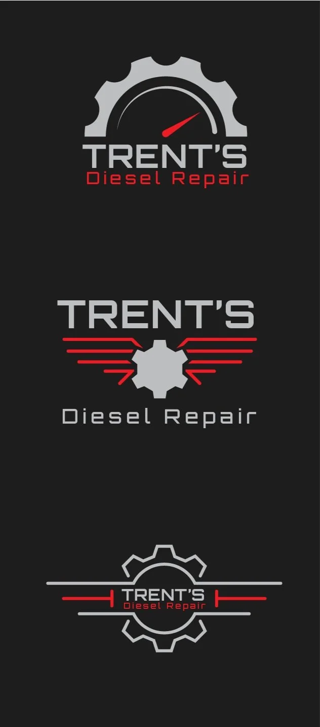
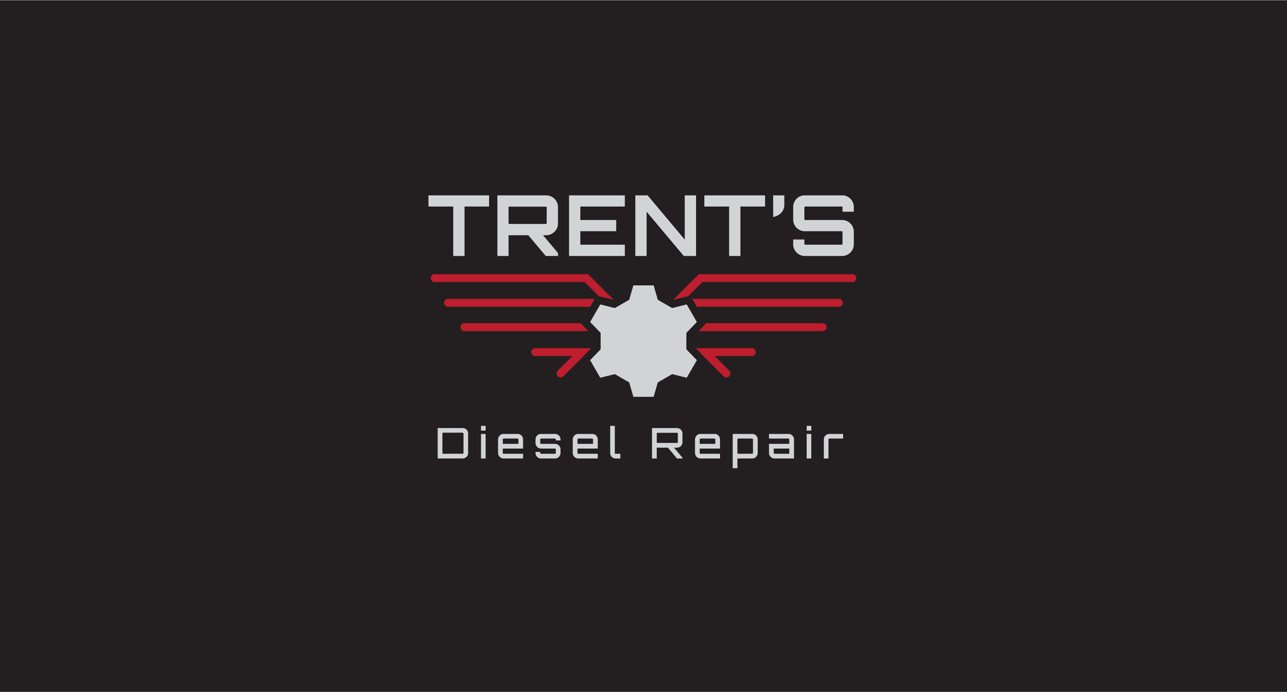
After the initial sketches, we decided to move in the direction of pictorial logo with the business name incorporated in it. After deciding on three choice sketches, I moved into Adobe Illustrator to create semi-final versions as options for the client. I chose a typeface that would invoke the element of a classic “manly” brand.
