Aerie
Design concept for local wildlife magazine
Aer·ie
Noun
a large nest of a bird of prey, especially an eagle, typically built high in a tree or on a cliff.
—Oxford Dictionary
The overview of the land for the casual outdoorsman.
Aerie is a magazine aimed at the casual Midwest outdoorsman and wildlife enthusiast, named after an eagle’s nest perched in high trees and atop cliffs.
Just as an eagle’s incredible view, this publication will provide the reader with current events and news about Midwest wildlife for conservationists, enthusiasts, and hobbyists. This magazine will cover current events in wildlife conservation such as efforts by the government as well as how individuals can do their part. Articles will be aimed at those whose hobbies surround wildlife such as hunters and fisherman, who’s lifestyles rely on being up to date on their current wildlife news.
Word Mark
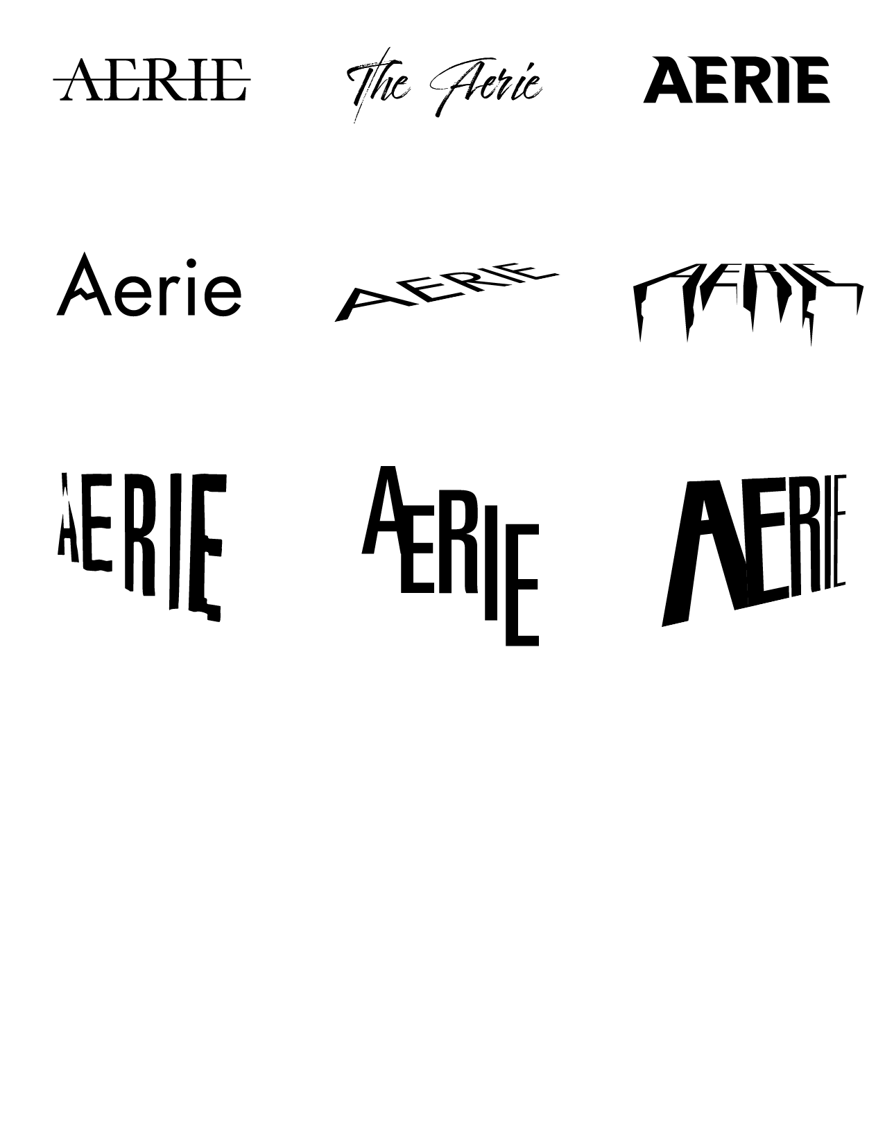
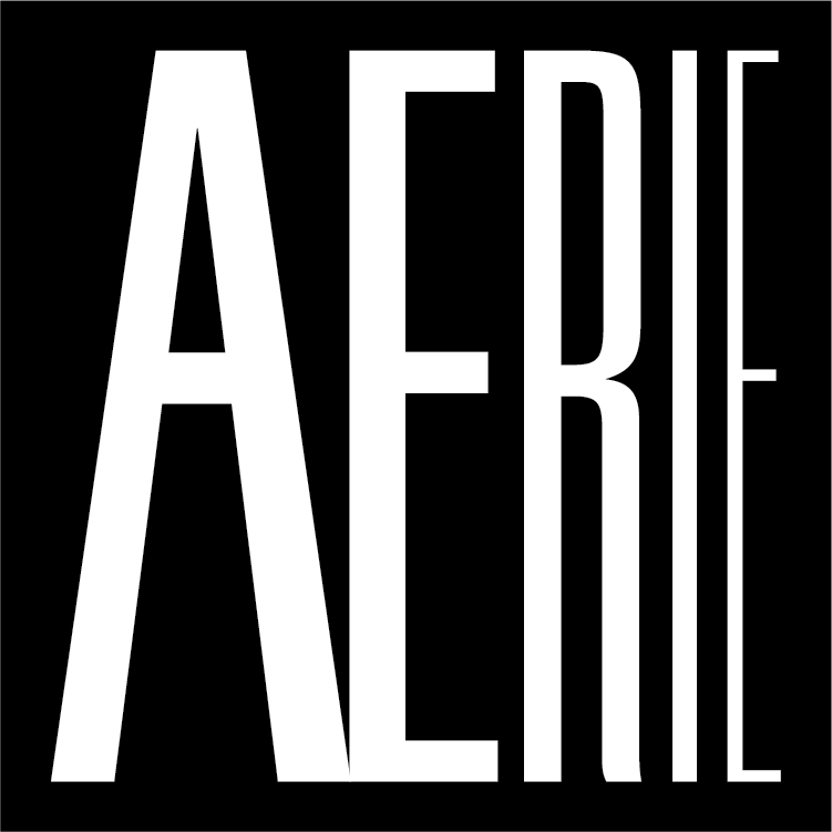
The magazine title and how it is presented is first thing a potential reader sees, and is crucial to the communication and message. The Aerie wordmark uses elongated letterforms that degress in weight to communicate towering perspective, mimicking those qualities of a vast cliff face. This word mark was designed through a handful of iterations, focusing on multiple aspects of nature.
Design Structure
Although uncommon in the US, Aerie uses an A4 paper size, which has a slightly taller ratio compared to traditional US letter. This reinforces Aerie’s connection to the cliff, overlooking the land beneath her.
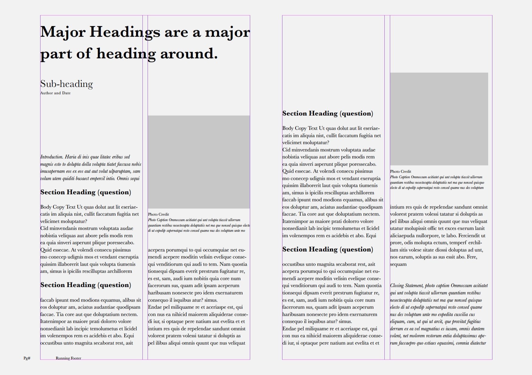
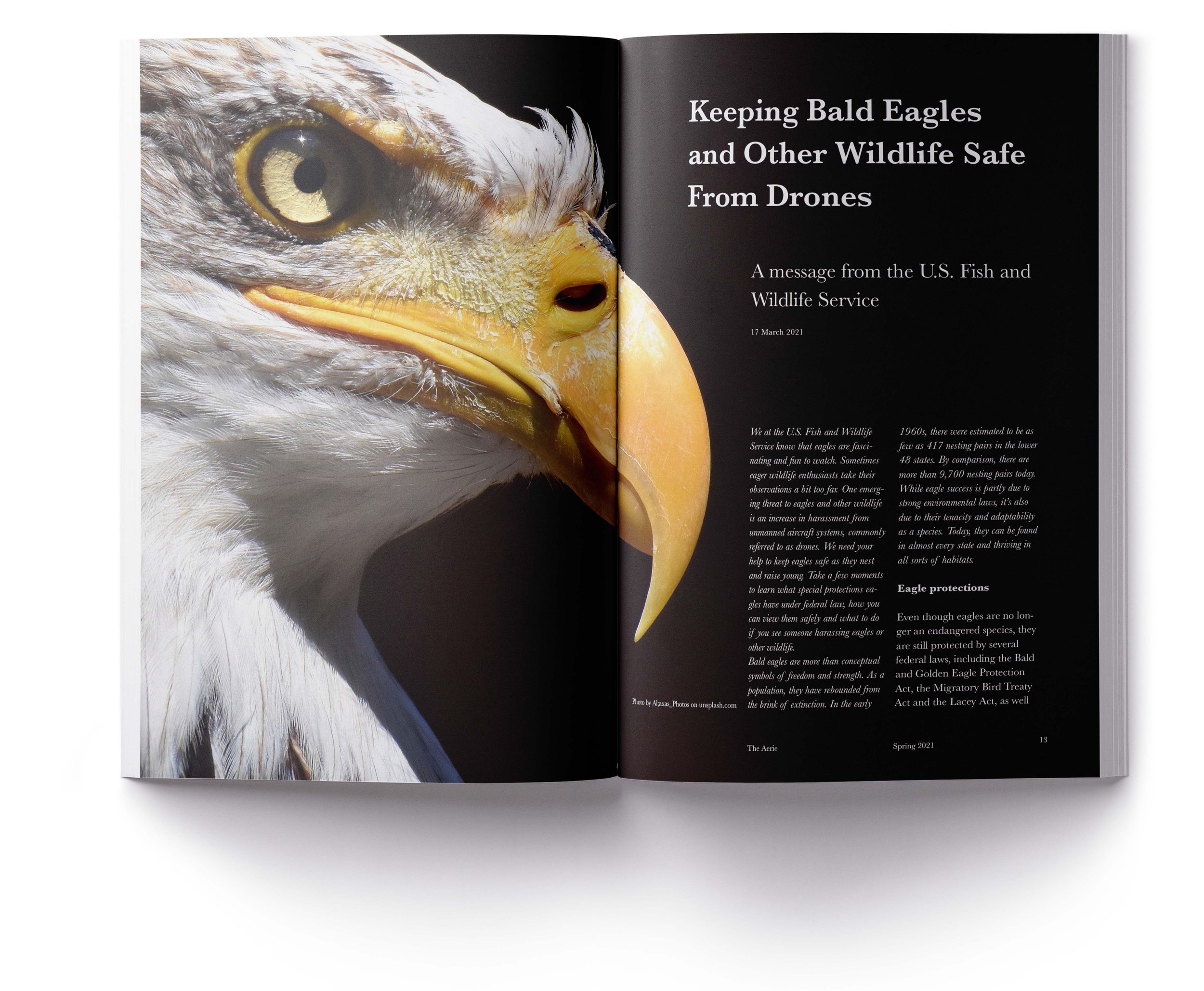
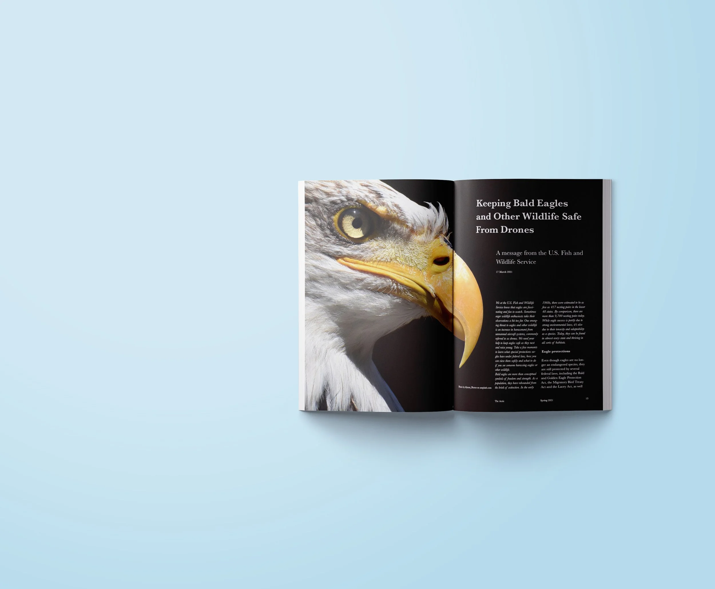
After Aerie uses a 6 column grid to allow for versatility in number of text columns, margin credits, and photography.
Photography
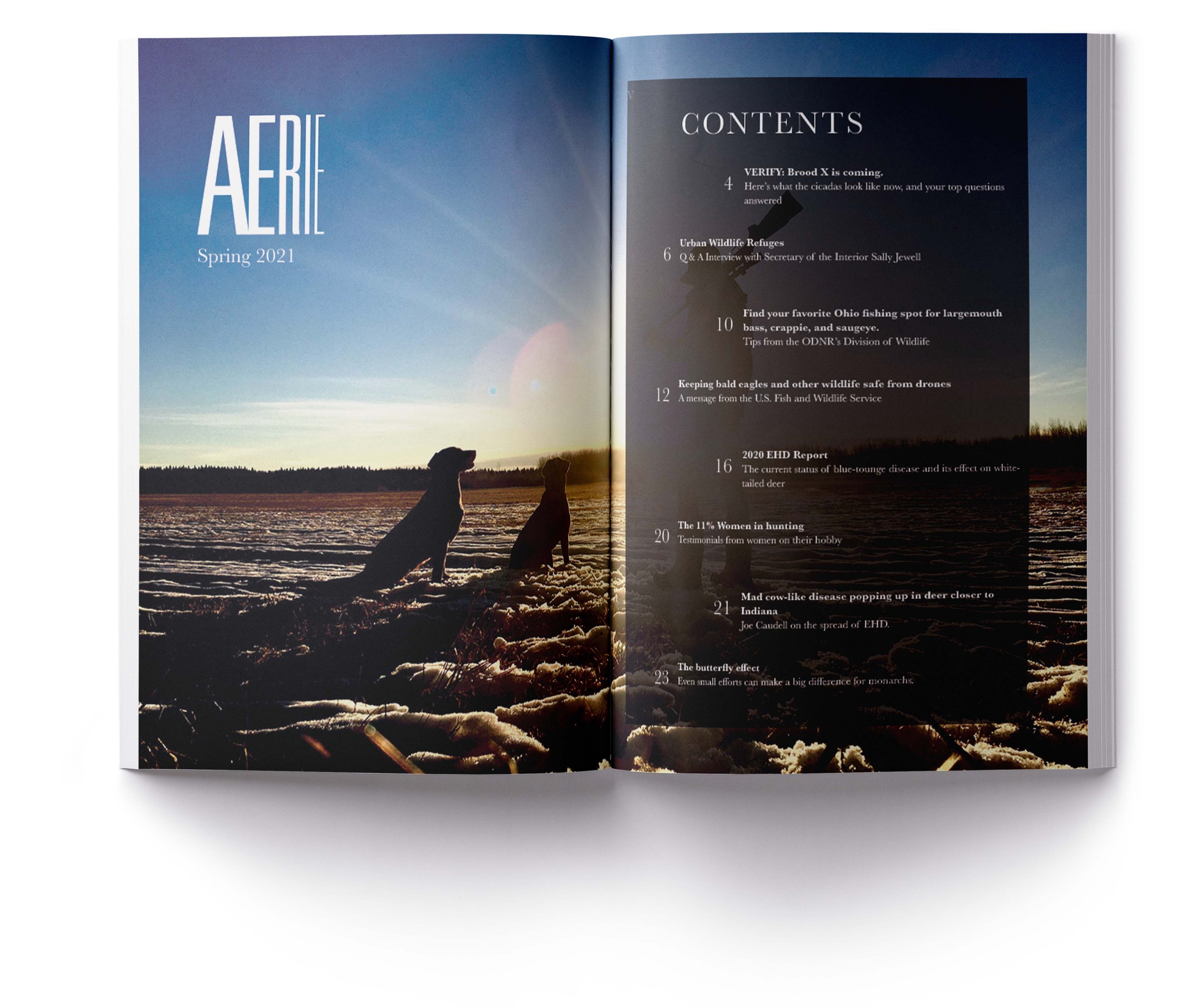
Nature is vast and beautiful, and deserves its space to match. Aerie uses wonderful photography of wildlife and lets it breath, often giving a full page to a photo and incorporating typography within it.
Typography
Aerie uses the Baskerville typeface throughout the publication for its timeless reputability. Although not an academic journal, Aerie uses a variety of scientific and data driven articles, which come with a need to be trustworthy and reliable.
Aerie uses black and white type only to let the color stories be defined by the beautiful photography.
